Showing posts with label medieval art. Show all posts

Saturday, October 27, 2012

English Gothic

Cross-posted from Monstrous Beauty

I like early Gothic stuff. I really like English early Gothic, especially the manuscripts,the "Matthew Paris school" stuff. This is a nice example. So what do I like about it? I like the very format of the pen drawing with the delicate tinting. I like the sharp crisp folds of the drapery. I like how the drawing violates the frame. I like the clean lines and expressive postures of the figures. I even like the lack of background.

This is a leaf from a missal for the "Parish de Pirton". The image is dated to 1220-1230. The verso of this leaf contains a 14th century charter for the rector of the church of St. John Baptist, Pirton (Worcestershire). Leaf is in the British Library (Harley Charter 83 A 37).

 Cross-posted from Monstrous Beauty

When I think Roman Art, this is not what I
think. This, however is indeed Roman from the first or second century. It was later reused by the Lombards. I did know that Romans did glass work and have seen a few pieces. Although the shape reminds of
the ubiquitous amphorae, I never considered that there would be this
 much color in one piece. In the British Museum. Image from wikimedia commons.


Friday, February 3, 2012

I made a video!!

Cross-posted from Monstrous Beauty.

I decided to play around with Window Lives Movie Maker, and grabbed a couple of manuscript images as material. I kept playing for a couple of days and ended up with this, a survey of illuminated manuscripts from papyrus scrolls to the Renaissance.

The choice of images is somewhat idiosyncratic, although most of the really famous manuscripts are included, there are some that are less than famous, and my own preferences may have resulted in some imbalance towards earlier manuscripts.

The music is from the Broadside Band and is decidedly anachronistic, being late 16th century. I was looking for something that sounded "medievalish" and I think it works.

Sunday, January 16, 2011

Apse Painting from Sant Climent de Taüll

Cross posted from Monstrous Beauty.


The Valle de Boi in Catalonia, with nine standing Romanesque churches and several ruins in about 85 square miles, has the densest concentration of Romanesque architecture in the world. The largest and best preserved of these churches is Sant Climent de Taüll, consecrated in 1123.

Catalonia in the 12th century was not a prosperous region and the builders of the church could not afford expensive mosaics, so the church was decorated with fresco. These frescoes are amongst the extant Romanesque murals. The apse mosaic is a Christ in Majesty, with Christ seated on the throne of the world. He is flanked by angels and is above medallions bearing the four beasts of the apocalypse. Mozarabic influence is seen in the broad bands of color that form the background.

In 1922 the murals of Sant Climent de Taüll were removed to protect them from theft and are now in the National Art Museum of Catalonia in Barcelona.

Image credit:
Wikipedia

Monday, December 20, 2010

Borgund Stave Church

Cross posted from Monstrous Beauty


This is the Borgund Stave Church in Borgund, Norway The church was built in the late 12 or early 13th century and is the best preserved medieval stave church. A stave church is a wooden church made with a type of post and beam construction. Almost all surviving stave churches are in Norway. One survives in Sweden and one was moved to what is now Poland. A similar, Anglo-Saxon palisade church survive in England. Although only a few of these churches remain, they were, at one time fairly common throughout northern Europe. Because masonry and other stone work survives better than construction in wood, it easy for modern viewers to loose sight of the reality that much medieval architecture was actually in made of perishable materials.


Image credits, Wikipedia.

Jeremiah, Church of Saint-Pierre, Moissac

Cross posted from Monstrous Beauty


The Church of Saint-Pierre, Moissac was on of the stopping points in southern France on the great pilgrimage road to Santiago de Compostela in northwestern Spain. The church and its cloister host one of the greatest and best preserved collections of Romanesque sculpture in France. Amongst the sculpture is the famous Jeremiah contained within the trumeau (center post) on the south portal. The front of the trumeau has three sets of crossed lions. The lions create a gently scalloped contour along the sides of the trumeau, mirroring the the deeply scalloped jambs on either side of the portal. On the right side of the trumeau, is the sculpture of the prophet Jeremiah. The elongated body and graceful cross-legged posture rises and falls above the over-sized feet to match the scalloping on the front of the trumeau. The hair and beard are stylized plaits formed of groups of incised parallel lines. The stylized drapery clings to the body. The face, unusually well preserved for a sculpture positioned so easily within reach of vandals, is delicate and expressive. The entire effect is not one of portraiture, but instead one of idealized spirituality and reflection.


Image credits:

Detail of head, Emmanuel (epierre) on Flickr.
Portal, Elena Giglia (eg65) on Flickr.
Frontal view and oblique view, tilina25 on Flickr.

Tuesday, December 14, 2010

Salisbury Cathedral


Salisbury was my first. I was an ignorant 18 year old, just graduated from high school, spending the summer in Europe. My brother and I were on our way to Stonehenge and when we got to the town of Salisbury and we found that we had missed the bus. The next one wouldn't run for an hour. We noticed a spire looming over the town, and decided to go take a look. Finding a massive cathedral set in the middle of a park, we thought it would be worth exploring. In 1981, you couldn't enter through the main west portal, instead you entered on the west end, but off to the side. As I came in, it all felt very familiar, we were in the sort of vestibule that any Anglican church might have. Then we turned a corner and were in the nave. To this day, the feeling of absolute awe I felt has stayed with me. Only one other time, high in the Rocky Mountains, have I ever been so completely struck. On that trip we saw other cathedrals, Canterbury, Westminster Abbey, and St. Stephen's in Vienna, but, for me, that initial feeling of shock and joy will always belong to Salibury. We didn't catch the next bus either.


Salisbury, is unusual amongst cathedrals in that it was built entirely one building campaign and was happily spared major renovations in later centuries. There were no previous buildings on the site that could have constrained the plans. As a result it was built largely in a single style and has a unity that many cathedrals lack.


Image credits:
First exterior, michaelday_bath on flickr
Second exterior, Stephen McParlin (stephen_dedalus) on flickr
Nave, ajoh198 on flickr

Monday, December 13, 2010

Sutton Hoo Buckle.

Cross posted from Monstrous Beauty


Sutton Hoo was one of the greatest archeological finds in the British history. The grave of a 7th century Anglo-Saxon king, excavated in 1939, contained a literal treasure hoard. One of the most impressive pieces was this large gold belt buckle. The main body of the buckle is an intricate mass interwoven animals, executed in chip carving with black niello highlights. The overall design is symmetrical although the details of interlacing are not. The main plate is hollow and has a hinged back, forming a secret compartment.

Friday, December 10, 2010

Bernward Doors

Cross posted from Monstrous Beauty.


The Bernward Doors, dating from 1015, are large bronze doors cast for the Cathedral of St. Mary in Hildesheim Germany, under the direction of Bishop Bernward. Bernward had visited Rome and may have been inspired by the ancient carved wooden doors of the Basilica of Santa Sabina. These doors represented a massive project for the time, being one of the largest cast bronze objects ever made in northern Europe. The left door contains eight scenes from the life of Adam, and the right eight scenes from the life of Christ. The scenes are carefully chosen and matched to emphasize the theological idea that Christ was the new Adam. For example, the Fall is matched with the Crucifixion, by which the fall was redeemed. The "trial" of Adam and Eve by God, is matched with the trial of Christ by Pilate.

The figures are set in a schematic space with a few plants or architectural details representing landscapes. The figures are in high relief, some of the heads lean out and become free of the background. Yet these nods to three dimensional reality for the scenes are undercut by the tendency for details, such as feet to overlap and break out of the surrounding frames.


Image credits:

Full door from Wikipedia.
Details from Sacred Destinations on Flickr.

Thursday, December 9, 2010

Carpet Page, Lindisfarne Gospels

Cross posted from Monstrous Beauty

Others may rave about the Chi Rho monogram from the Book of Kells, but for my money, this is the single most impressive piece of illumination from the Middle Ages. This is one of the carpet pages from the Lindisfarne Gospels. It's said that each of the carpet pages in the Lindisfarne Gospels have an intentional error in the knotwork. Good luck finding it.

Wednesday, December 8, 2010

Lewis Chessmen

Cross posted from Monstrous Beauty


The Lewis chessmen are a group of chess pieces discovered on the Isle of Lewis in 1831. They were carved from walrus ivory and whale teeth in the 12th Century in Norway. There are 78 pieces: 8 kings, 8 queens, 16 bishops, 15 knights, 12 rooks, and 19 pawns, from as many as 5 different sets. The pieces were probably part of the stock of a trader dealing in luxury goods. Some of the pieces bear traces of red pigment, indicating that the two sides were white and red, unlike the modern white and black. Unlike modern chess sets, the rooks are portrayed as soldiers, including four berserks, chewing their shields, while the pawns are small geometric pieces, resembling standing stones.


The collection was split up soon after its discovery. The Museum of Scotland now owns 11 of the pieces, while the British Museum owns the balance. A exhibition of pieces from both the Museum of Scotland and the British Museum, along with related artifacts is currently touring Great Britain. I hope it come to North America.


Image credits:
Berserk Rook, Rook, and Knight, RobRoyAus on Flickr.
All others, Wikimedia Commons

Monday, July 26, 2010

Orion from Leiden Aratea

Cross posted from Monstrous Beauty


Orion the Hunter from the Leiden Aratea. This is one of the great works of the Carolingian Renaissance, which how shows how thoroughly classical art was revived. This is such a close copy of its late antique model that is it was at one time thought to be of late antique provenence itself. Note the use of shading to model Orion's musculature. This had not been done in a realistic way for centuries when this manuscript was made. The text in this manuscript is know as the Aratea is by Germanicus and is based on the Phainomena of Aratus and is an introduction to the constellations. Germanicus is best remembered as the popular adoptive grandson of Augustus and grandfather of Nero. In Graves I, Claudius he was poisoned by Livia and Caligula. The Leiden university library has posted a digital facsimile of the manuscript here.

Leiden Aratea Leiden, Universiteitsbibliotheek, Voss. lat. Q 79, f. 58v.

Wednesday, March 31, 2010

Chi Rho monograms.

Cross posted from Monstrous Beauty

Last night I talked a bit about the Chi Rho monogram in the Stockholm Codex Aureus. It got me thinking about how often these monograms show up in insular gospel books. So I decided to see how may I could find and spent a couple of hours poking around looking for images of them. This is by no means a comprehensive list, but here are the ones I found, in roughly chronological order.

First up is the Book of Durrow, dating to the middle of the 7th century. The Chi is enlarged, the Rho slightly smaller, the whole line is enlarged and set off and colored yellow. It is n0t really known where the manuscript was made, although it was probably made somewhere in Ireland.

Durrow is followed by the Lindisfarne Gospels of about 7o0. This is a quantum leap with the Chi Rho dominating the page. The Chi and the Rho are extensively decorated. All of the text on the page is turned into one large decorative pattern. One of my favorite things about the Lindisfarne Gospels is how the artist would "draw" with the decorative red dots found in so many insular manuscripts. Here he has "written" with them to form the letters of the line following the Chi Rho monogram completely out of the red dots. The Lindisfarne Gospels are known to have been produced on the Island of Lindisfarne off the east coast of Northumberland.

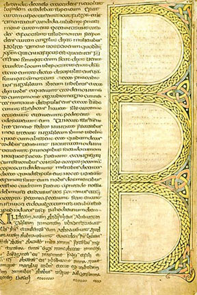
Next up is an unnamed manuscript in the British Library (Royal MS 1 B VII). This is a smaller scale effort, as this is not as sumptuous of a manuscript. The zoomorphic Chi Rho Initial is as about as large as the initials which begins each of the gospels. The scribe started a new column at the Chi Rho initial, as if he were starting a new work, leaving the bottom of the left column blank. (The text in the obviously different script at the bottom of the left hand column is a later addition, a manumission of a slave in Old English.) This manuscript was produced in the first half of the 8th century in Northumbria.

Next is the St. Gall Gospels, now housed in the monastery at St. Gall in Switzerland. This manuscript was produced by monks in Ireland about 750 and brought with them when St. Gall was founded. By this point, Chi is taken over the page, leaving room for only a few words of additional text, which is so stylized and decorated as to be unreadable. (This and Lindisfarne are my two favorites.)

Next up is our friend from last night, the Stockholm Codex Aureus. This is somewhat more restrained, although the text is seen as a decorated pattern with legibility allowed to be lost to aesthetics. This manuscript was produced somewhere in Southumbria, probably Canterbury. The influence of the Roman Church mission at Canterbury probably exerted a restraining influence on the wilder "Celtic" traditions seen in more northern insular manuscripts. This manuscript dates to about 750.

This one needs no introduction. It is, of course, the Chi Rho page from the Book of Kells and easily one of the most famous manuscript images of the middle ages. Exuberance abounds and there is no restraint. (Despite its fame, I still like Lindisfarne better. Does that make me a heretic?)


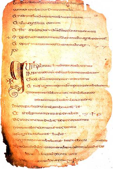
This is from another unnamed manuscript in the British Library, (Royal MS 1 B VII). In a sense Kells was at once the culmination and last gasp of the Insular tradition. After Kells the Carolingian Renaissance got underway, and the insular style fell out of favor. The truly deluxe manuscripts of the era looked to classical models. Still some manuscripts were made in the Insular style. This manuscript is from about a century after Kells. Although the Chi Rho monogram is present it is more closely related to the zoomorphic initial of the other unnamed British Library manuscript than to the Durrow, Lindisfarne, St. Gall, and Kells.


This is from the the Bodmin Gospels which was made in the 9th or 10th century. This is not a deluxe manuscript, so, although the Chi is emphasized it is not a major piece of illumination.

This is from the Book of Deer, which was made in Scotland in the 10th century. One day I will have to talk more about this manuscript in detail. It is a relatively small scale, somewhat odd manuscript, but is clearly still following the Insular tradition.

This is the Corpus Irish Gospels, now owned by Corpus Christi College, Oxford. It was produced in the twelfth century, almost 500 years after the Book of Durrow. It, along with the next manuscript show the extreme tenacity with which this style had in Ireland. This monogram with its interlace decoration on spiral motifs would be at home in manuscripts centuries older.


My final manuscript is the Gospels of Mael Brigte, which are firmly dated by a colophon to 1138. Although simpler in decoration than the the Corpus Gospels, this manuscript is also done in the insular style, centuries after the style's high point and shows the enduring popularity of the style in Ireland.

Tuesday, March 30, 2010

Stockholm Codex Aureus

It's been a long while since I posted anything here, but I'm back, at least for the moment. Cross posted from Monstrous Beauty

This is the Stockholm Codex Aureus (Stockholm, Royal Library, MS A. 135), also known as the Codex Aureus of Canterbury. "Codex Aureus" can be translated as "Golden Book" and refers to the liberal use gold leaf used in the decoration of this manuscript. There are several other manuscripts known as the Codex Aureus as well, so you have to specify which one you are dealing with. Stockholm refers to its current location, while Canterbury refers to where it was probably made.

This is a Gospel Book and contains the Latin text of the four gospels. (I'm not sure what version, but I would bet that it is the mix of Vulgate and Vetus Latina found in other insular gospels). I also don't know what texts, other than the Gospels it contains, although I do know that it has Canon Tables. I would assume that some of the prefatory matter found in other Insular Gospels is present. There are 193 extant folios. Alternating folios have been dyed purple. The text is written in an uncial script in black, white, red, gold and silver inks. There are two surviving evangelist portraits, six decorated canon tables and seven decorated initials.

The portrait of Matthew shown here, is quite different from the highly stylized and abstracted portraits in other Insular manuscripts. Matthew is seated on throne within an arcade with pillars. Curtains hanging from above are wrapped around the pillars. In the tympanum above is his symbol, the winged man. There is little in the way decoration and the composition lacks the elaborate decorated borders found in some of the other insular manuscripts. Although the elements, including Matthew himself, are stylized and flattened the entire composition has a serene monumental quality. In many ways, this can be seen as a precursor to later Anglo-Saxon and Carolingian styles.

The facing text page, however, would be comfortably at home in any of the great Insular manuscripts like Kells or Durrow. The text block and each line of text is contained within a frame. The text lines alternate between a gilded background and golden letters, creating a dazzling effect. The opening initial is an elaborate monogram decorated with interlaced patterns and laid on a background of spiral motifs. As can be seen by the detail below, the draftsmanship is quite high.

That the evangelist portrait faces this page is quite interesting. The initial monogram is of the Greek letters Chi and Rho (XP). This monogram was often used as in place of the word for "Christ". The interesting thing is that, although evangelist portraits were usually placed at the beginning of a gospel, this is not the beginning of the Gospel of Matthew. This is the text which begins at Matthew 1:18. The preceding 17 verses contain a genealogy of Christ, and the actual narrative of Christ's life starts here. In insular manuscripts, the genealogy was often treated almost as a separate work and this "second beginning" was often given its own frontispiece, although this is the only manuscript that I am aware of that moves the evangelist portrait here. The enlarged, decorated Chi Rho monogram at this point in the text is a motif that is limited to insular gospel books.

This manuscript was at Christ Church, Oxford in the 9th century. It was looted by the Vikings, ransomed by Earl Alfred (later King Alfred). At some time in the middle ages it was lost again. It was found by a Swede in 1690 in Spain and purchased for the Swedish Royal Library

Monday, April 20, 2009

Manuscripts on the web: The British Library

Cross posted from Monstrous Beauty.

So, I like to go looking around the web for pretty pictures. One type of pretty picture I look for is illuminated manuscript images. One thing that I've found is that several institutions have done a great job digitizing images and making them available. Here are some of the places I've found.

Let's start with the big one. The British Library. The British Library, of course, has one of the best collections in the world. The Bibliotheque Nationale and the Vatican Library are the only close contenders I can think of.

The British Library is fairly generous, there are three ways they make manuscripts available. The big one is their Catalogue of Illuminated manuscripts. Thousands of manuscripts are cataloged here. (Over 1500 from the Harley collection alone.) Each manuscript has a upwards to twenty or so images available. The down side is that they are going methodically through the collections, and they haven't included the Cotton or Additional Manuscript collections yet, and that is where a lot of the really good stuff is.

Equally impressive is their Online Gallery of illuminated manuscripts. This used to be part of their Collect Britain site, and focused on manuscripts made in Britain. Each page is treated as separate work, but you can search by shelfmark. There are plenty of images of little known manuscripts. There are also illuminated manuscript images scattered through some of the other galleries. The Online Galleries also has a Virtual Books section with in depth looks at several important books including a late 17th cent Ethiopian Bible, the "Golf Book, the Luttrell Psalter, the Golden Haggadah, a 15th Century Hebrew Bible from Lisbon, the Sforza Hours, the Sherborne Missal, and the Lindisfarne Gospels. I can't make this feature work due to limitations of my computer and my lack of Geek skills.

A final place to look for images is the Images Online. This is primarily intended as a site to sell high quality images, but their previews are good enough quality for casual browsing. You can find images from many manuscripts not found at the other Brirish Library sites.

Finally for the British Library if you are looking for information on manuscripts, but not images, there is the Manuscript Catalogue. The entries in the catalog range from fairly complete articles, with bibliography to a few words in Latin.

Tuesday, April 14, 2009

Codex Manesse

Cross-posted from Monstrous Beauty

The Codex Manesse (Heidelberg, University Library, Cod. Pal. germ. 848) is a German manuscript, which was produced in Zürich between 1304 and 1340. It is an important literary manuscript, as it is the single most comprehensive source of Middle High German love songs, the songs of the minnesängers. There are 140 poets represented, who range in social status from the Emperor Henry VI to commoners. As important as the manuscript is for literary history, it is best known for its illuminations. There are 137 portraits of poets, many of them shown in full armor with heraldic devices. These illuminations have been widely reproduced, so much so that are almost the stereotype of High Medieval art. The last I was at Barnes and Noble I noticed at three books with cover art drawn from the Codex Manesse. The illustrations have also been widely used as decorative motifs. I have some wooden plaques with reproductions of some of these pages on my walls right now. Here are some of the images.


Emperor Henry VI, Fol. 6r.


Conradin, Duke of Swabia, King of Jerusalem, King of Sicily, Fol 7r.


Henry I, Count of Anhalt (The manuscript calls him Duke in error), Fol 17r.


And, since this is a manuscript of songs, here is recreation of one of the songs.

Wednesday, July 2, 2008

Durham Cathedral Library, MS A II 10

Cross posted from Monstrous Beauty

First a little bit about the "name" of this manuscript. If you are already familiar with how shelfmarks work, you can skip to the next paragraph. Many manuscripts are famous and have names that are well known outside of the realm of medievalists, the Book of Kells for example. Others are more obscure, but are well known to medievalists, the Quedlinburg Itala or the Vatican Virgil, for example. Others may have names that uniquely identify them, but are not well known to anyone other than a specialist. Most manuscripts don't have names, though, and are identified only by shelfmarks. Shelfmarks are the cataloging labels given to each manuscript by the institution that holds it. Each institution makes its own rules as to how to assign shelfmarks. Some just number them; MS 1, MS 2, etc. Others will sort by their manuscripts into collections, and number each collection. The collections may be sorted by language, or manuscript type, or by donor. Some large institutions might have several different types of collections. In any case, the full shelfmark will identify a manuscript precisely. (Some institutions that only hold a few manuscripts, or perhaps only one, don't use shelfmarks at all.) These shelfmarks are a kind of secret passwords for medievalists. You stand a much better chance of getting an institution to let you look at a manuscript if you know its shelfmark. Some institutions, rather than simply numbering the manuscript, use a more complicated scheme, that gives you the precise location of the manuscript. To do this you must identify the bookcase a manuscript is in, the shelf of the bookcase, and the position of the manuscript on the shelf. This is what Durham Cathedral does. This manuscript is A II 10. This translates to the first bookcase (A), the second shelf (II), and the tenth manuscript (10).

This manuscript is a fragment of an early Insular gospel book. It is usually known only by the its shelfmark because there are at least two other fragmentary Insular gospel books at Durham Cathedral (MSS A II 16, and A II 17). MS A II 17 is sometimes called the "Durham Gospels". Kirsten Ataoguz at Early Medieval Art calls this the "Earlier Durham Gospels" and A II 17 the later Durham Gospels.

This manuscript is earliest in a sequence of magnificently decorated gospel books that stretches to the Book of Kells and beyond. This manuscript dates to the early 7th century and is not much younger than the Cathach of St. Columba. The surviving fragments contain two important pieces of decoration, on facing pages. Folio 3v* (see illustration above) contains the end of the the Gospel of Matthew. The text is in the left hand column, the other column contains a frame shaped like three capital letter "Ds" stacked one on top of the other. Each frame is decorated with a knot work pattern, and each frame has a different pattern. (Dr. Ataoguz suggests having students describe these patterns as an exercise in observation and description. Other than noting that the lower 'D' is decorated with a traditional three strand braid, I would find this very difficult.) The triangular spaces between, above and below the "D" frames are filled with larger, looser triangular knots. Inside the frames are written the explicit** to Matthew, the incipit** to the Gospel of Mark, and the Pater Noster, or Lord's Prayer, in Greek, but written in Latin letters. Facing this page is the opening page to the Gospel of Mark. (see illustration at right.) It starts with a large decorated initial. This initial takes the first three letters of the the opening word "Initium" and fuses them into a large monogram. The monogram is shorter on the right side than it is on the left. Each subsequent letter in the opening word is smaller than the preceding letter. This diminuation of letters was first seen in the Cathach. A manuscript of Jerome at Bobbio from the early 7th century also contains an "INI" monogram that is very similar in form to this monogram (see illustration below). This would suggest a fairly wide spread artistic convention.

This manuscript, fragmentary as it is, is still quite important. It is has the first surviving appearance of the knotwork that would a major motif in later Insular manuscripts. The later Insular gospel books would all use monograms similar to the "INI" monogram used here. It shows the continuation of the strong tradition of the diminuation of letters after an enlarged intitial.

The Bobbio Jerome initial. My apologies for the low quality of the image.


* Most manuscripts were not paginated as modern books are. In modern books, each side of a single leaf is given a new page number. Manuscripts are usually foliated, where each leaf is give a number. The two sides are then termed the "recto" and the "verso". The recto is the "front" side, that is the side that is on the right side of the book when it is opened. The other side, the verso is on the left side of the open book. Individual sides of folios are indicated by giving the folio number and an "r" or "v" for recto or verso.

**The incipit and explicit are the terms for text introducing announcing the beginning (incipit) and end (explicit) of a text. An incipit may read something like, "Here begins the Gospel of our Lord Jesus Christ according to Saint Matthew". For the most part, except for an occasional "The End" at the end of some novels, this practice has died out in modern books.

Thursday, June 19, 2008

Bobbio Orosius

Cross posted from Monstrous Beauty.

The Bobbio Orosius, from the 7th century, introduces an important motif to insular art, the Carpet Page. This is the oldest surviving carpet page. The design is not similar to the Carpet Pages in the later more famous gospel books (Durrow, Lindisfarne, Kells), but its purpose seem to have been similar; To serve as a sort of internal cover. As Dr. J. Kirsten Ataoguz points out over at Early Medieval Art, the Bobbio Orosius carpet page can be compared, at least in layout to the cover of the Stoneyhurst Gospels. (see below for image.) Like the later gospel books this carpet page faces a decorated initial. (I regret not having an image of the initial, and the poor image of the carpet page here, but it is all that is available on the net.)

The Bobbio Orosius also represents an important movement in the religious and artistic history of Europe. Although the manuscript was produced at a monastery in Italy, it was produced by Irish monks. The monastery in question, Bobbio was founded by St. Columbanus, who was from Ireland. Many important communities on the continent were founded by Irish monks. Many of the important "insular" manuscripts were in fact produced in the scriptoria of these communities. These monasteries were to play a vital role in the religious and artistic life of the next several centuries.

The manuscript itself (Milan, Biblioteca Ambrosiana MS D. 23. Sup.) is a copy of the Chronicon of Orosius. In the seventtenth century it was given to the newly established Ambrosian Library in Milan, where it remains today. Dr. Ataoguz also has a discussion of this manuscript at Early Medieval Art.

The Stonyhurst Gospel Covers

Saturday, June 7, 2008

Cathach of St. Columba

The Cathach of St. Columba is the starting point for Celtic manuscripts. The traditional story is that Columba was lent a psalter by St. Finnian on the condition that he not copy it. Columba nevertheless copied in a single miraculous all-night session. When Finnian discovered the manuscript, he appealed to the local king, who awarded the copy to Finnian. Columba raised his kinsmen which resulted in the Battle of Cúl Dreimhne. Columba went into exile, where he founded Iona, as penance for the men killed in the battle. The Cathach is traditionally identified with Columba's copy. The Cathach, however, has been dated to the 7th century on paleological grounds. Throughout the Middle Ages it was carried into battle as a talisman, a practice from which it gets it name. "Cathach" means "battler" in Irish.

The decoration in the Cathach is limited to the first few letters of each Psalm. This decoration establishes several themes that are explored in great depth in later manuscripts. The first letter of each Psalm is enlarged. In earlier manuscripts initial letters had been enlarged and decorated. Bit the decorations in those manuscripts were used to fill space or were appended to the latter. In the Cathach, the decoration distorts the shape of the letter, so that the letter becomes the decoration. Subsequent letters were drawn into the decoration through the gradual shrinking of the letters. In earlier manuscripts the letters after the first letter were the same size as the he rest of the text. In the Cathach, each subsequent letter is a bit smaller than the preceding letter until the letters reach the size of the bulk of the text. The letters are often decorated with small red dots. These three ideas the distortion of letters for decoration, the dimidation of letters, and the use red dots for decoration are ideas worked out in great detail later.

Wednesday, April 9, 2008

Schizophrenia

Taking a cue from my brother, I have sort of split up this blog. I have copied all of my medieval art posts over to a new blog, Monstrous Beauty. Although I will be posting all of my medieval stuff there, I will also post it here, so if you are interested in finding out what birds I've seen lately and whatever manuscript takes my fancy you can read here. If you are only interested in the art, you can stay over there. I expect I will split out the birds also. I also will be starting a blog on Oklahoma architecture and history and another on political rants. Again if you want the full experience, stay here. There will be material here that won't be found elsewhere.

On the new blog, I intend to discuss not only manuscripts, but the whole range of medieval art. I reserve the right to define "medieval" and "art" however the hell I wish. I also hope to be able to point to other resources on medieval art. On the name, Monstrous Beauty, it comes from Bernard of Clairvaux, who when discussing (and denouncing) the Romanesque art that decorated the churches of his day railed against the "beautiful monstrosities and monstrous beauties" he found. I like Romanesque art, and the term "Monstrous Beauty" is indeed a great description of it.